Uppbeat has become more than a place to find great music, animations and sound effects. It’s become a home for creators who want their ideas to feel original and fully theirs. And as Uppbeat keeps expanding, we realised something important: the way the platform looked didn’t fully capture the energy, personality, and creativity of the people using it.
We set out to evolve the visuals across Uppbeat to better reflect the real humans behind the content – you! In this article you’ll see what’s changed, why it matters, and how these updates make the platform feel more intuitive and aligned with the way you create.
- Why Uppbeat needed a new look
- How the Uppbeat look has evolved
- Putting real creativity first across Uppbeat
- What Uppbeat’s evolution represents
Why Uppbeat needed a new look
Uppbeat has grown beyond its early days as a music library. Today, creators come to us for music, sound effects, VFX animations, and tools that help them bring ideas to life. With that shift, we needed a look that matched who we’ve become, and who you are.
Before we even touched colours or typefaces, we wrote down five key principles to guide every design decision:
- Human – Imperfect, personal, intuitive and creative above all else.
- Adaptable – Able to flex across different creator communities and genres.
- Enduring – Built to last, not ride short-lived trends.
- Connected – Reflecting the link between artists, creators, and audiences.
- Playful – Joyful, fun and charming; never too serious.
These ideas helped us shape a visual direction for Uppbeat that feels more alive and aligned with the everyday reality of modern creators.
How has the Uppbeat look evolved?
Rather than making big, disruptive changes, we focused on refining the small details that shape your experience. Each tweak is subtle, but together, they make Uppbeat feel clearer, friendlier, and easier to create with.
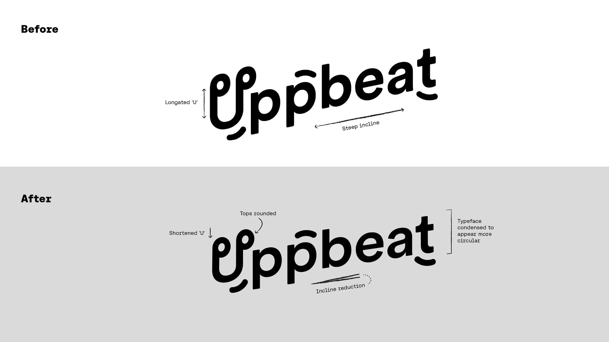
A logo that works harder everywhere
You’ll still recognise the Uppbeat wordmark, but we’ve straightened its tilt to give it a cleaner, more grounded shape. It now aligns neatly across the platform and feels more balanced wherever it appears.
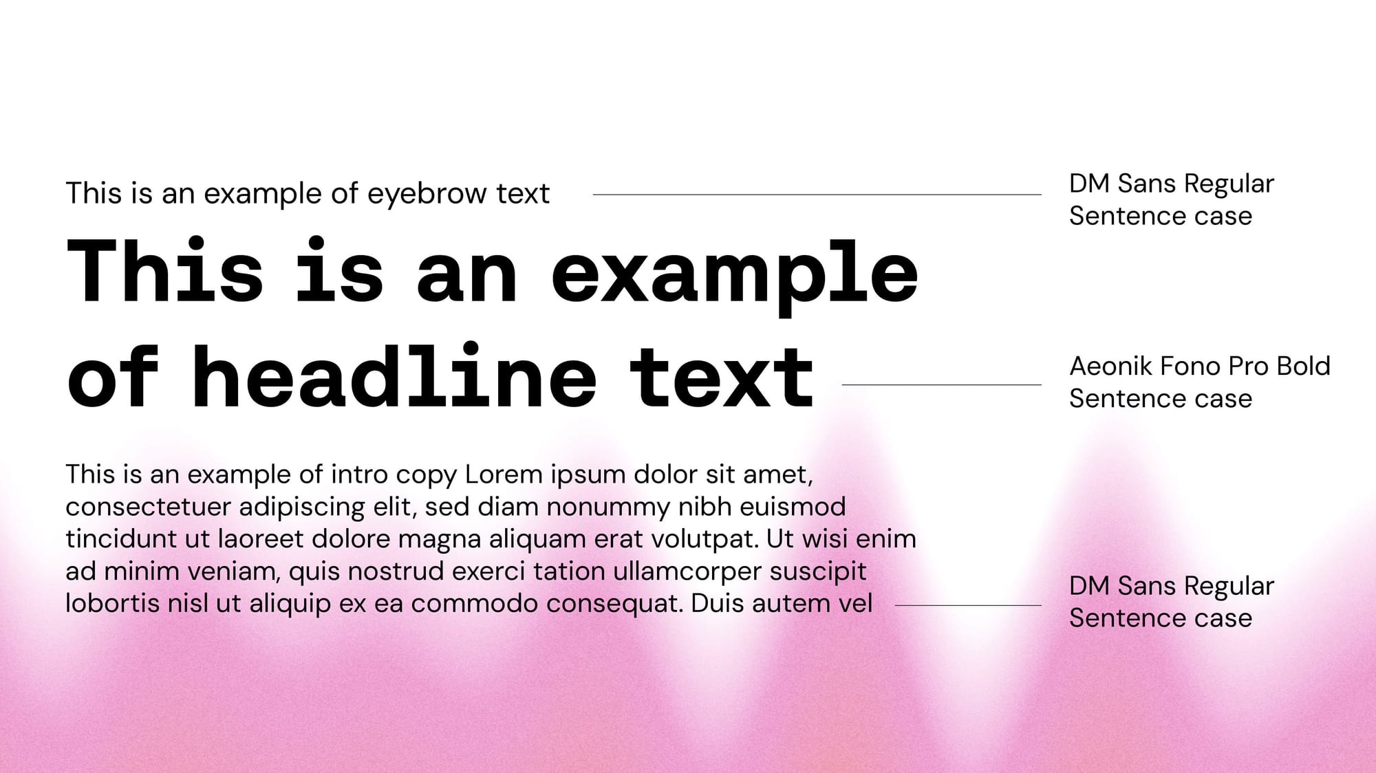
Typography that feels expressive yet clean
We introduced a pairing that captures both sides of creativity: the nostalgia of physical media and the expressive energy of next-gen storytellers. Aeonik Fono has a gentle wobble to it - a sort of beautiful imperfection that immediately feels human. DM Sans is clean, friendly, and modern, giving structure when things need to be crystal clear. Together they tell stories with warmth and clarity. They’re modern, expressive and easy to read without losing character.
Icons with personality built in
The updated icons are clearer and more intuitive at a glance, but still carry small quirks that keep things feeling human. They’re precise where they need to be, and playful enough to bring a little joy to everyday interactions.
Textures that add depth, not noise
Soundwave textures inspired by our audio roots help bring more life to the interface without pulling focus from what matters most: discovering great creative assets.
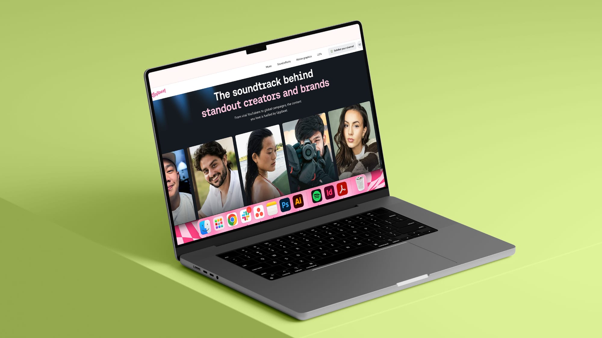
How Uppbeat’s showing the real people behind the content
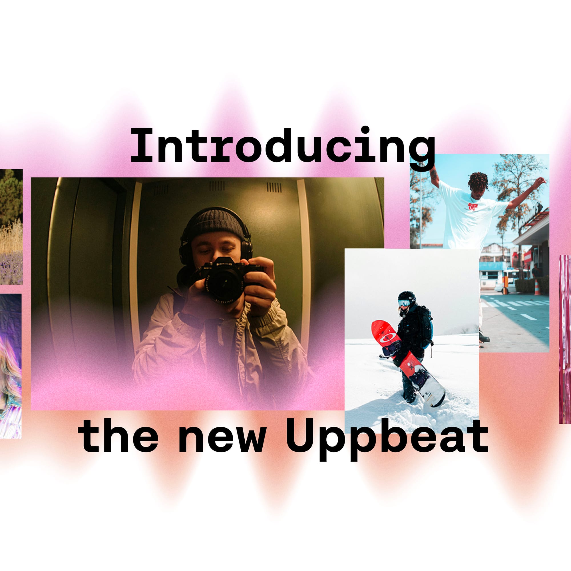
Everything on Uppbeat is powered by real creators – the artists making music, the designers crafting animations, and people like you using those assets to bring videos to life. We wanted our visuals to show all sides of our creator community.
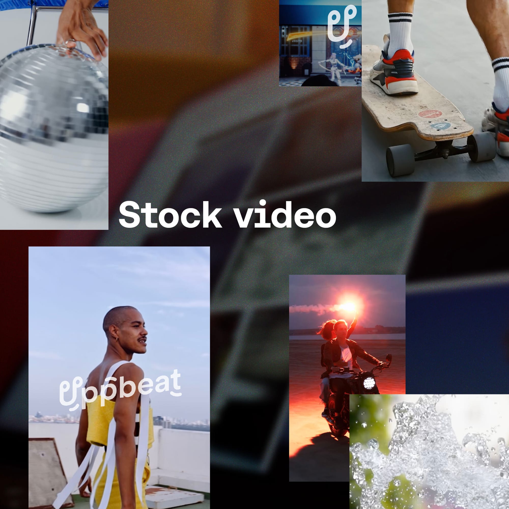
You’ll now see more authentic photography and human-centered moments woven through the platform. It’s a simple reminder that creativity isn’t automated or anonymous – it comes from people doing what they love before the edit even starts!
Uppbeat’s new look shows real snowboarders in the cold air, cooks in the chaos of flavour testing, friends belly laughing and skaters perfecting their tricks. It’s authentic and more than a bit imperfect, because the joy of creating doesn’t begin at the computer and we want to tell the whole story.
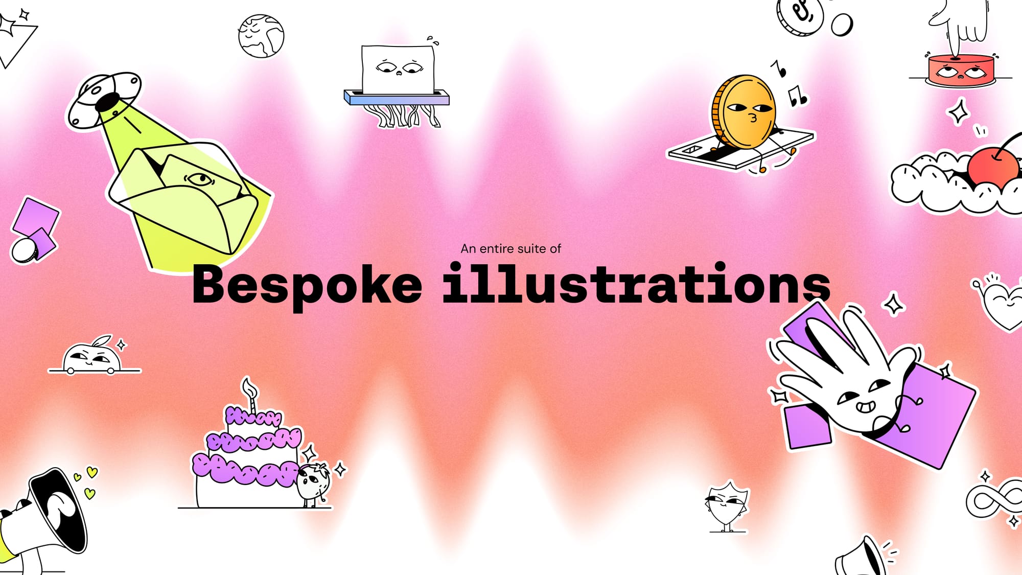
Illustrations drawn by human hands
In an era where so many visuals can feel algorithmic, our in-house illustrator Sian created hand-drawn illustrations that embrace human imperfection. Their expressive lines and textures add warmth and reinforce that creativity is a fundamentally human act, something Uppbeat celebrates.
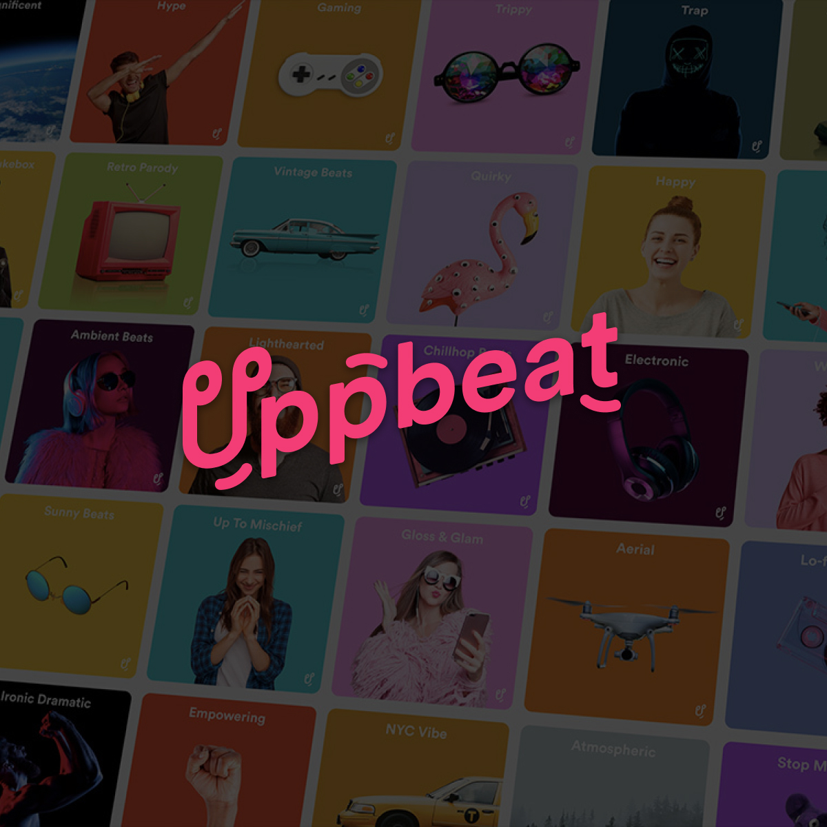
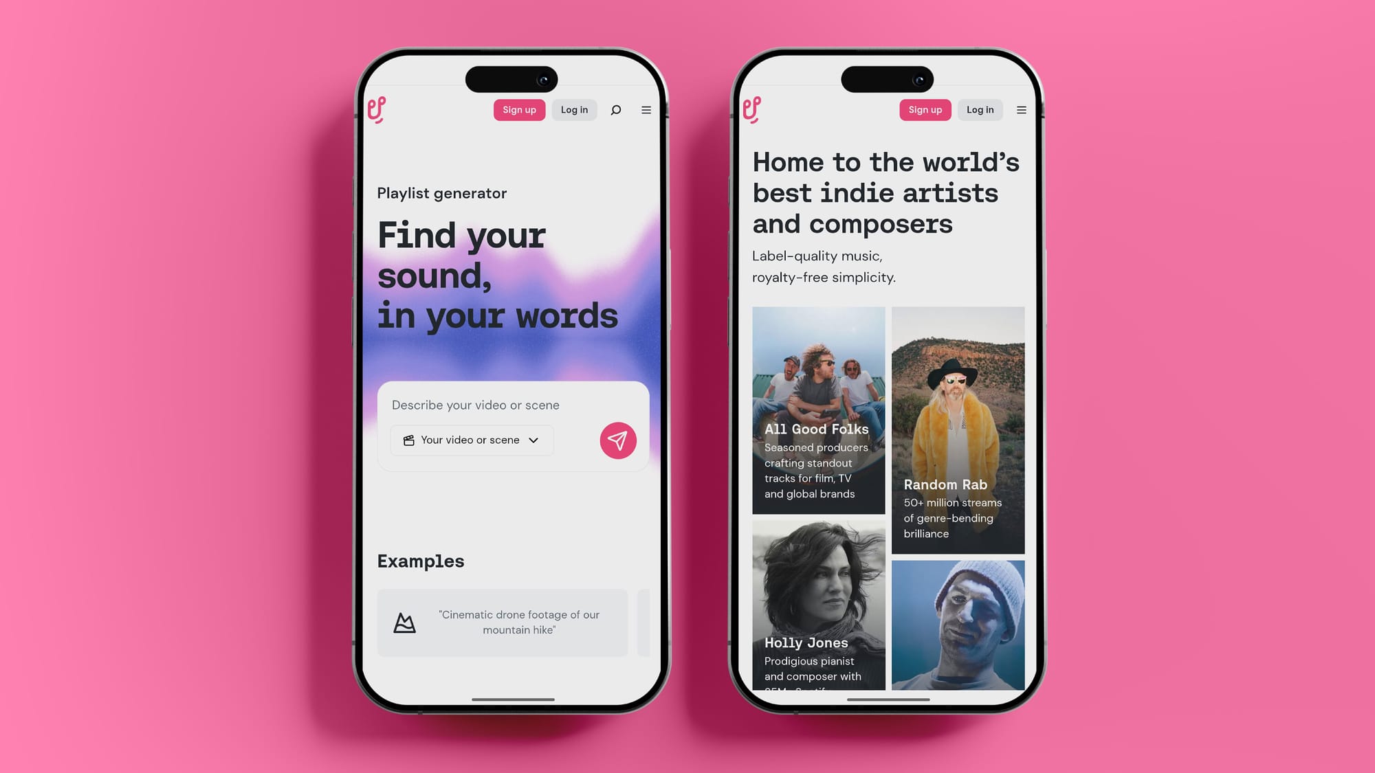
600 new collection covers designed to spark discovery
Collections are one of our superpowers at Uppbeat – no-one curates for subcultures the way our team does. And this year, we redesigned nearly 600 collection tiles from the ground up.
Every single one has been carefully crafted by our in-house team, combining trend-hunting intuition with Uppbeat’s warmth, energy, and character. These aren’t generic covers; they’re little windows into the moods, aesthetics, and identities of countless communities. They reflect the expert, human-led selection behind the music in each collection and make it even easier for creators to find the sound that speaks to their world.
What Uppbeat’s evolution represents and why it matters
Uppbeat has always been about real creativity. All the music, sound effects, motion graphics and LUTs you find on the platform are made by an actual artist – never AI – and our revenue-share model makes sure those artists are properly supported. In a world where automation is everywhere, sticking to that feels more important than ever.
This evolution isn’t just a new look. It’s a clearer expression of what we care about: a platform that feels warm, intuitive, and genuinely welcoming to anyone creating. Something that celebrates individuality, embraces the slightly chaotic joy of making things, and gives proper credit to the artists whose work brings your stories to life.
At the end of the day, Uppbeat belongs to you and the artists behind the content you use. These updates are our way of honouring both – human-made, full of character, and built for real creative lives.