
Every time you upload to YouTube, getting those early views matters. That initial momentum can transform how well your video performs. And if you know when your potential viewers are online, it makes it that much easier to time your uploads to catch them at the right moment. YouTube's audience activity chart gives you exactly that insight.
The chart in YouTube Studio can feel a little cryptic the first time you look at it, but it’s a lot simpler than it looks. In this guide, we’ll show you how to identify your ideal upload window so you can schedule your videos accordingly. By the end you’ll know how to read your audience heatmap and how to use that information to give your uploads a boost.
Creator Questions takes common creator problems and tackles them head-on. These are real questions from actual creators and the Uppbeat community, along with practical advice that you can apply to your own uploads.

What's the challenge?
Getting your videos seen by as many people as possible starts with knowing when your audience is online. When you publish while your subscribers are already active, your video has a much better chance of picking up early views and engagement faster. YouTube uses those signals to decide whether to recommend your content more widely, so getting your timing right consistently gives each upload a better shot at that initial push.
YouTube's own Creator Insider team has pointed out that publishing when your audience is active gives your video a better chance of earning the early clicks and watch time that kickstart distribution. The heatmap is the most direct way to find that window for your specific channel.
YouTube's audience activity heatmap can be found in the Audience tab of YouTube Studio. It shows a grid of colored boxes across a 24-hour day, where each box represents one hour. Shading gets darker as activity increases, giving you a quick visual read on when your audience is most likely to be online.
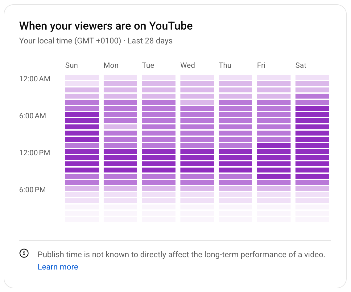
The important thing to remember is that this chart reflects when your current subscribers are active on YouTube, not just when they watch your videos. It's a useful proxy, but not a precise minute-by-minute schedule for your audience's behavior.

Why this matters for creators
YouTube's audience activity chart takes the guesswork out of when your viewers are most likely to watch your content. This saves you from targeting upload windows at random or scheduling content at times where it might fall flat.
The thing is, the time you publish your video might matter less than you might expect. YouTube's Creator Insider team explains that although posting when your viewers are active can help, long-term performance comes down to the fundamentals. You'll always need an interesting topic, a strong thumbnail, a compelling title, and content that actually keeps people watching.
A video with a weak hook published at the perfect time will still underperform a great video published two hours later. VFX YouTuber, Ignace Aleya, has spoken about the importance of giving every video the best possible start: "Curiosity is what you need to show in the first two or three seconds to hook people in. After that, you have to be clear and intentional about what your audience is going to see and then deliver on that."
That said, if you want to squeeze a bit more out of your timing, reading the chart correctly is a useful skill. Timing your upload so your audience is active when the video goes live gives those vital first seconds a larger pool of people to reach.

Uppbeat's take: Read the chart as a window, not a minute
The most useful thing the heatmap can do is show you a broad window for you to upload your content, not a single perfect minute. Treat it as a guide to find your 1-to-3 hours of higher activity, then schedule your upload to land inside that window. Find your heatmap in the Audience tab of YouTube Studio and put this into practice:
1) Look for the darkest cluster, not the darkest single box. A run of darker shading across two or three adjacent boxes is more reliable than a single dark cell. That cluster is your peak window and a more stable target for scheduling.
2) Aim to publish slightly before your peak. Videos take a few minutes to process after upload, and don't always appear in feeds instantly. Scheduling your upload 15 to 30 minutes before your darkest window means the video is fully visible by the time your audience is most active.
3) Check the chart across multiple days before changing anything. A single day's heatmap can be skewed by unusual activity. Look at the pattern across a full week to find a consistent peak rather than reacting to a single spike.
4) Test and track the result. After shifting your upload time based on the chart, monitor your YouTube analytics for the next few uploads. Check whether early watch time and click-through rate improved, not just total views, which can take days to accumulate. If you see an improvement, you can use these insights to boost your future videos.
5) If the time you posted didn’t make a difference, look at your title and thumbnail. In most cases, a stronger title or a more compelling thumbnail will do more for your early performance than adjusting your upload window further. If they’re working well, your content should see a strong click-through rate. Our guide to YouTube click-through rate covers what good looks like and how to improve it.

Use YouTube’s chart to guide your schedule, then focus on what's in the video
The audience activity heatmap is a genuinely useful tool once you know what each box is showing you. Read it as a window of opportunity rather than a precise target. Then schedule your uploads to land inside your peak cluster and check your analytics to see whether the shift made a difference over time.
Once your timing is dialed in, the bigger gains come from what happens inside the video itself. Retention data is ultimately a stronger signal than the hour you published. Our guide to YouTube analytics shows exactly where to find the retention data that tells you whether viewers are sticking around once they've clicked.